I absolutely love negative space.
In discussing art and design it’s easy to overlook how important negative space can be to a composition. Not everything important is put on the canvas or in the sculpture, sometimes the most important bits are deliberately left off.
The reason for this is because our brains are extremely capable of filling in the gaps of missing information and extrapolating meaning. It turns out that this ability is part of why we have been so successful as a species; we don’t need to see or hear everything to understand what is going on.
This ability can save our lives depending on the situation. It also has to be said it can also mess us up when we see things and patterns that don’t exist.

There are visual puzzles that play on this ability, like the one that asks if you see a pair of faces or a vase or the one with an old man’s face or an Eskimo. The only thing drawn in these puzzles are dark shapes that technically define one image, but if you focus on the negative space you suddenly see an entirely different image.
Most uses of negative space aren’t intended to be visual puzzles; instead most seek to eliminate the superfluous, only keeping what is necessary to allow our brains to create the final product, often in surprising ways.

Peter and the Wolf
Some applications can be very simple like the arrow in the FedEx logo or more elaborate like this poster design for Peter and the Wolf.
Our brains fill in empty spaces to create new images. Pulling this off successfully is difficult; leave too much and the object or image looks unfinished, leave too little and it is difficult to discern what it is supposed to be. That is why when I see something that does it well, I have to applaud the makers.
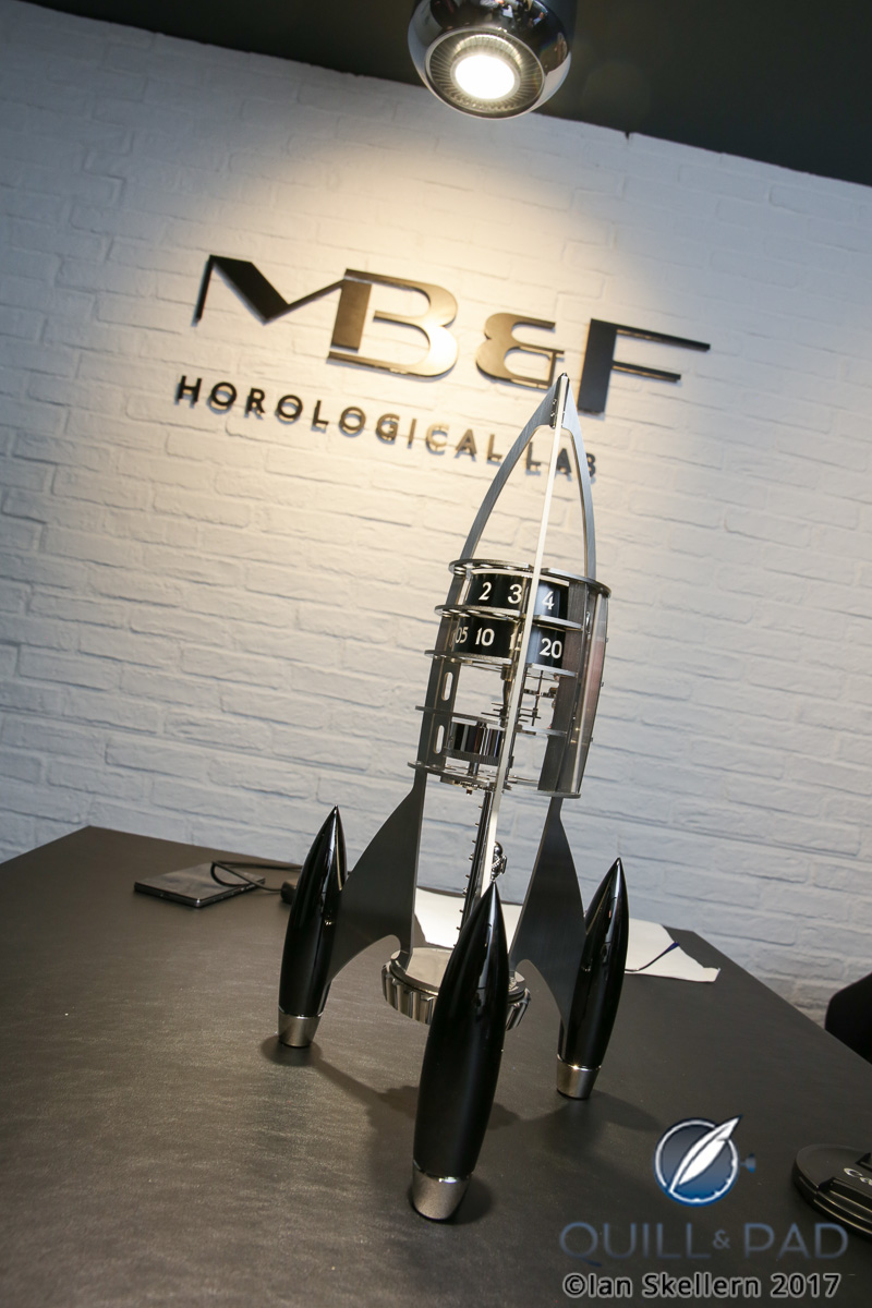
MB&F Destination Moon
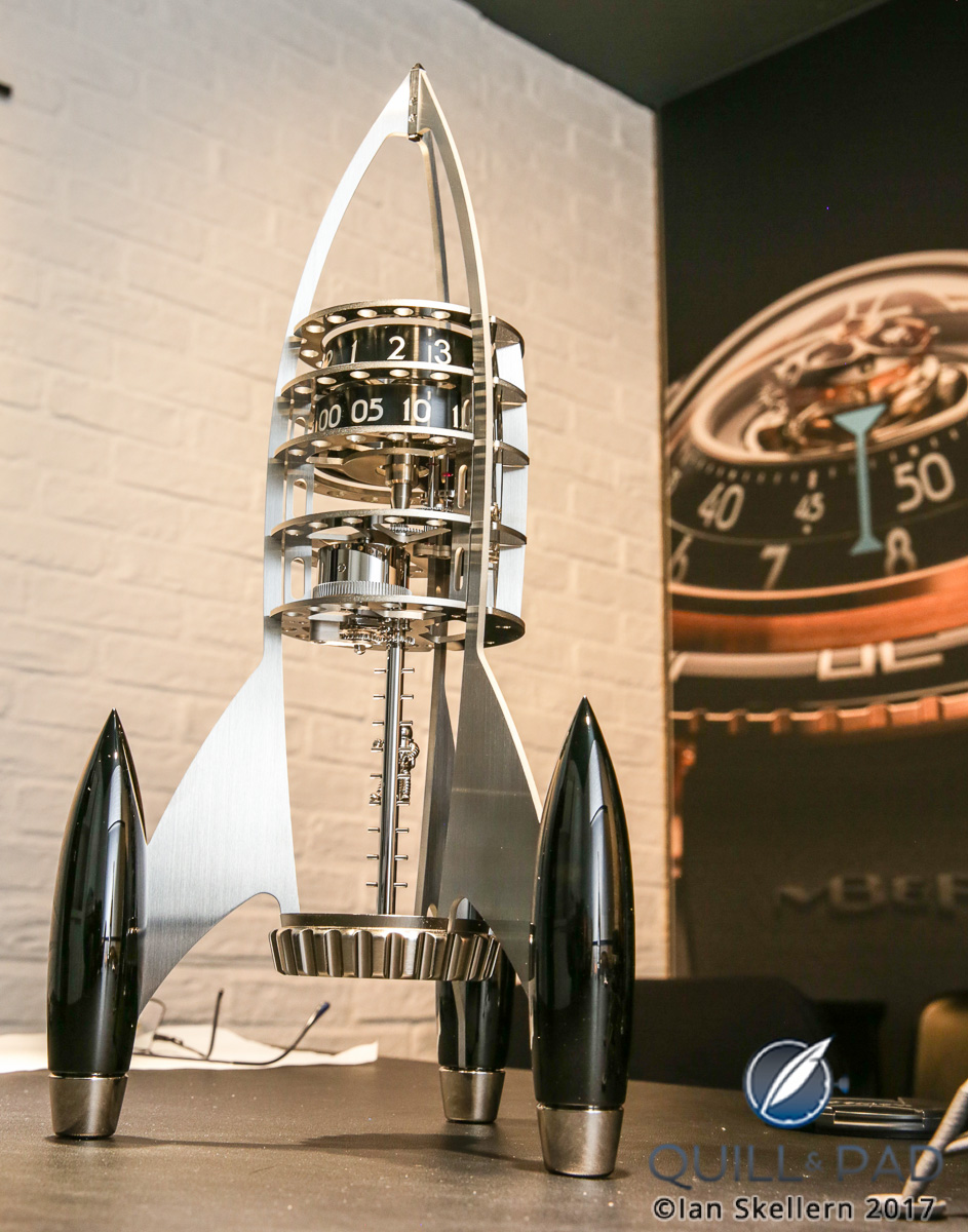
The deliberate use of negative spaces has been rarely, if ever, seen in the world of horology, however it should be no surprise that the experimental boutique brand MB&F has now created a piece where the viewer’s imagination plays as important a role as the largely empty physical structure. That creation is Destination Moon, a rocket-shaped clock made in collaboration with L’Epée 1839.
MB&F Destination Moon Black and Blue
And, as it turns out, not building everything worked pretty darn well.
Why is the destination the moon?
Destination Moon is a clock that uses the power of the mind to fill in the blanks and create its shape.
The clock is clearly a rocket ship. And I say clearly as literally as possible in both meanings of the word because you can literally see right through the entire thing as there is only an ethereal thin frame in the shape of a rocket. The entire structure has been kept as minimal as absolutely possible, allowing the viewer to create the rocket of their own youth.
We all grew up at different times with different influences. Some people will have a very specific idea of what a rocket ship should look like, while others will say it should be totally different.
The first concept prototype of Destination Moon had panels covering the ship, creating one defined shape. But while it looked awesome, it lacked the “magic” that usually defines an MB&F/L’Epée 1839 clock.
When the designers removed the panels and were left with just the underlying frame, it suddenly became filled with possibility, because the viewer’s brain fills in the blanks, creating its own understanding of what the rocket should look like.
Vertical regulator on MB&F Destination Moon
This not only engages your brain to comprehend the form, but also your sense of wonder and imagination. When you are actively engaged in a piece of art because your brain needs to figure it out, you will immediately have a much stronger connection to it.
Of course this works in favor of MB&F: I loved Destination Moon instantly and I’m sure others will too. Previous clocks have been pretty clearly defined (not a bad thing), and some have had moving components that owners could interact with, and these have proven very popular.
Destination Moon is the perhaps the first clock in which viewers will take an active role with not only the physical structure, but the visual understanding of the clock.
As design goes, this is a smart strategy for optimizing desire.
What is there to desire?
And oh, what a clock to desire!
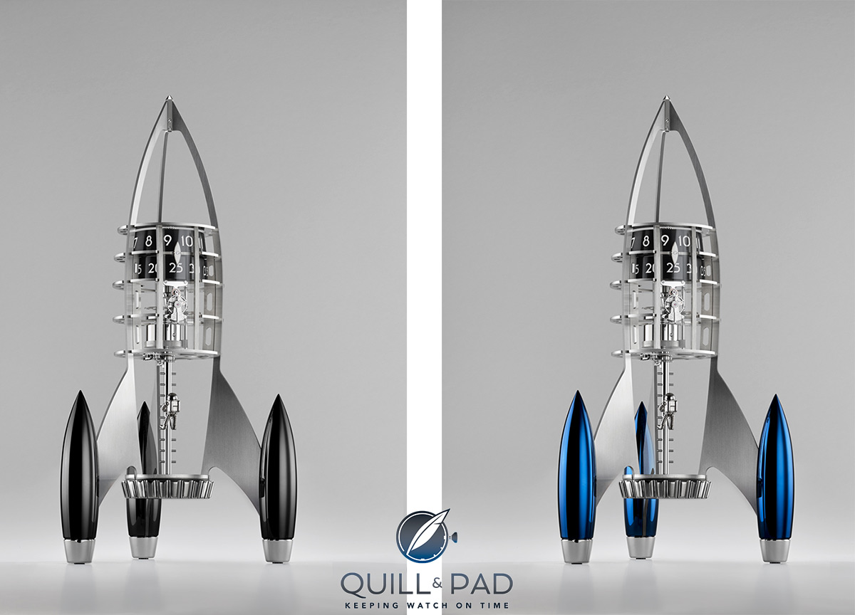
The basic construction shares some inspiration with the HM7 Aquapod (see Medusa In The Sea: Introducing The MB&F Horological Machine No. 7 Aquapod – Live Photos And Wristshots) in that the entire movement architecture is vertically aligned, all the way from the winding crown at the base up to the time-adjusting knob on the nose of the rocket.
All the gear wheels climb up to the top of the rocket one layer at a time. This creates a lot of visual movement upward, appropriate because this rocket ship is set to blast off to the moon.
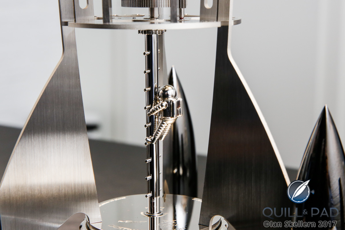
At some point, it may have already landed on the moon because a miniature astronaut called Neil is climbing on the central boarding ladder leading from the movement to the winding crown, either heading up to venture out or climbing down to explore.
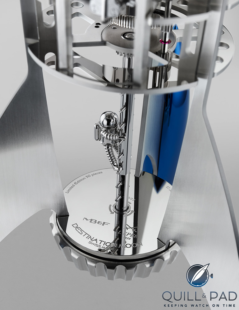
Neil climbing (or descending) MB&F’s Destination Moon
The figure is solid Sterling silver with a stainless steel helmet; magnets embedded into the figure allows it to magnetically attach to the ladder in any position. This way you can make it your own adventure and place “Neil” wherever on the ladder you wish.
Neil, your flight is boarding now!
The boarding ladder is also the winding stem, so while winding “Neil” will spin on the ladder as the rocket is charged for launch. Above the ladder section is the fuel tank, a large eight-day spring barrel tied to the rest of the movement layers. The going train is mostly located on the second tier of the rocket, though it takes up so very little volume as to not fill the space too much.
The balance and escapement are also on this level, but rotated vertically for increased visual interest. I know I like seeing a ship’s brain on display. This is the only place on the movement that is contained, if invisibly, thanks to a tall curved section of mineral glass spanning the four tiers of the crew compartment (Neil has to sleep somewhere).
MB&F explains that this viewing window helps keep the balance protected from both “cosmic radiation and curious fingers.”
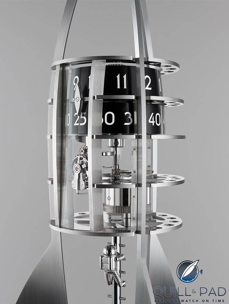
Clockwork of MB&F’s Destination Moon
Moving to the third and fourth tier we find the time display, two large black cylinders with stamped numerals around the perimeter. Underneath the mineral glass lies a double-tipped indicator for adjusting and reading the time accurately.
In my imagination I see these cylinders as the artificial gravity rooms where Neil would go to prepare for his time back on earth or the moon. The lower moon gravity would be simulated in the slowly rotating hour cylinder or the higher earth gravity in the faster moving minute cylinder.
Of course, this is where my imagination goes, so perhaps you’ll see something else.
Finally, in the nose cone of the rocket you find an adjustment knob for setting the time, so the movement architecture is literally nestled between two knobs on either end. That may be a first, though with the multitude of clocks made throughout history that would almost surely be impossible to claim with any certainty.
Regardless, the structure of the movement is as minimal as possible, and only the two time cylinders and the rocket fins provide any definitive shape to Destination Moon.
MB&F Destination Moon
Seeing what isn’t there
The fins and the solid, palladium-plated and highly polished (and colored) landing pods are complete shapes with no room for imaginary interpretation. But moving up from there, it is easy to see that there is only a skeleton of a rocket ship.
The frame provides just enough information to understand that it is supposed to be a gently shaped rocket, but the rest is just the imagination of your mind. The tiers act as ribs to give even more structure to the clock but don’t force any defined details for the shape.
The plates for each tier are shaped like Meccano pieces with holes machined through, opening up the interior shape even more. The assembly is stunning, and yet there technically isn’t much there at all.
The mechanics and the frame are as minimal as possible, with only the time display and landing pods providing any definite form. This is a great example of utilizing negative space with only the bare essentials for guidance.
Without an individual’s imagination, Destination Moon would appear as a partially assembled rocket, but thanks to millions of years of evolution, our brains turn it into something spectacular without even trying.
This might be the most stunningly simple creation MB&F has ever made, and I can imagine it will be very popular with space and rocket-science nerds everywhere.
I am delighted that after the fully formed creations between MB&F and L’Epée 1839 that have come before, Destination Moon bucks the trend and opts for a completely new yet comfortably familiar visual style.
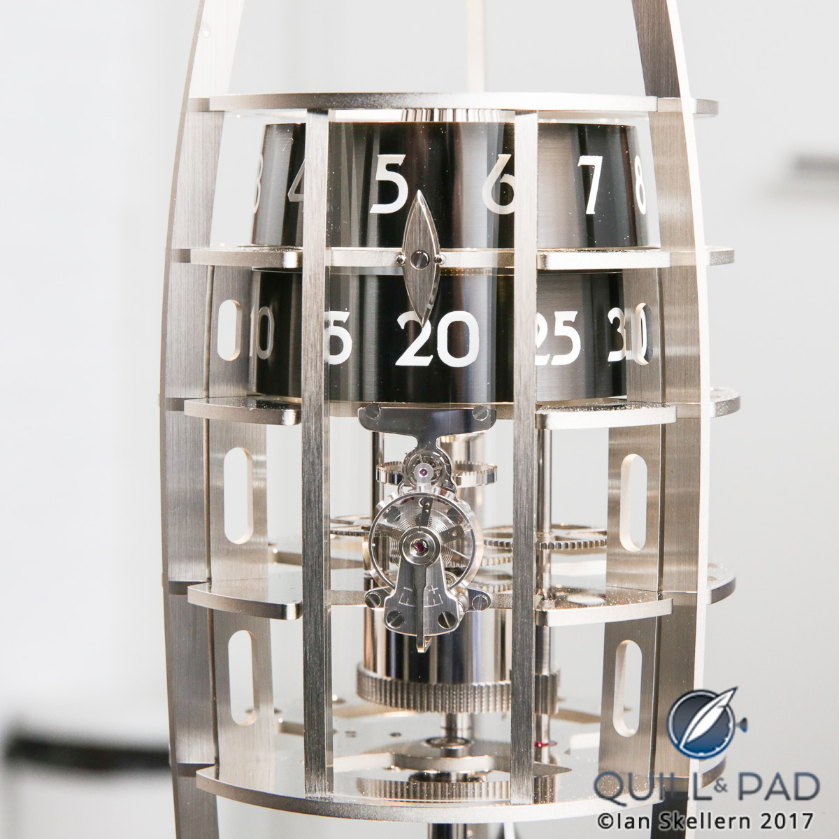
Allowing everyone the chance to see what they want to see has created a “people’s” rocket ship, one that anyone and everyone is welcome aboard. However if you want to purchase one, you should know they are limited to 50 pieces each of four variations, each with a different color for the landing pods in polished palladium, blue, green, or black PVD.
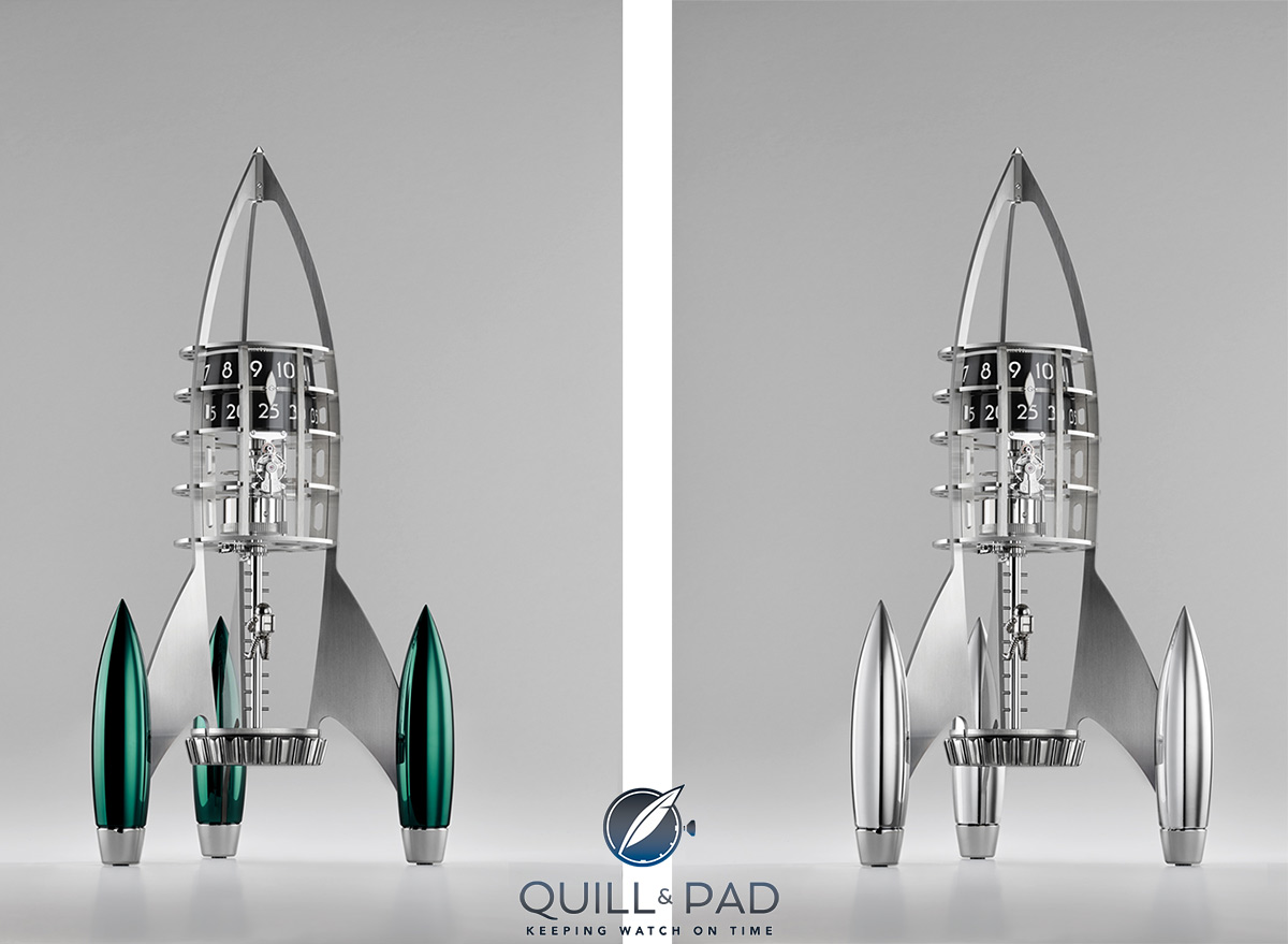
MB&F Destination Moon Green and Silver
I’m not sure what you see, but I see a new favorite clock destined for my shelf! Well, at least a framed picture of one.
For more information, please visit www.mbandf.com.
Quick Facts
Frame: 41.4 cm (height) x 23.3 cm (diameter) stainless steel, palladium-plated brass, blue, green, black PVD
Movement: manually wound in-house movement by L’Epée 1839
Functions: hours, minutes
Limitation: 50 pieces each in polished palladium, blue, green, black PVD palladium
Price: 19,900 Swiss francs (excluding VAT)