The Jack Heuer 80th Birthday Edition Carrera is one of the most anticipated TAG Heuer watches in some time. The watch was first shown at Baselworld in March, and while it is not yet in the stores, we have been able to get our hands on an advanced prototype watch for a few days of use in the real world so that we can bring you the first review.
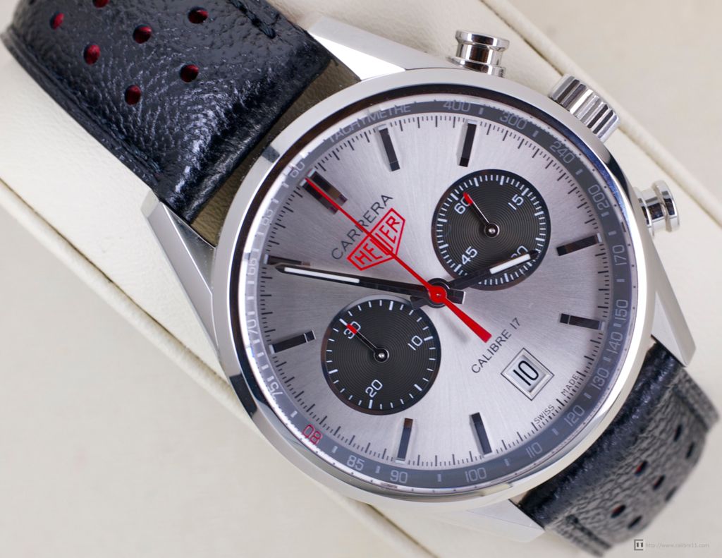 As the name suggests, this Carrera is made to mark the 80th Birthday of Jack Heuer, the grandson of the TAG Heuer founder and CEO of company during its dynamic period of innovation in the 1970s. You can read about the background to the watch at our earlier Baselworld post- here.
Dial & Hands
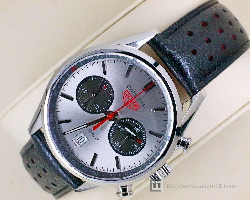
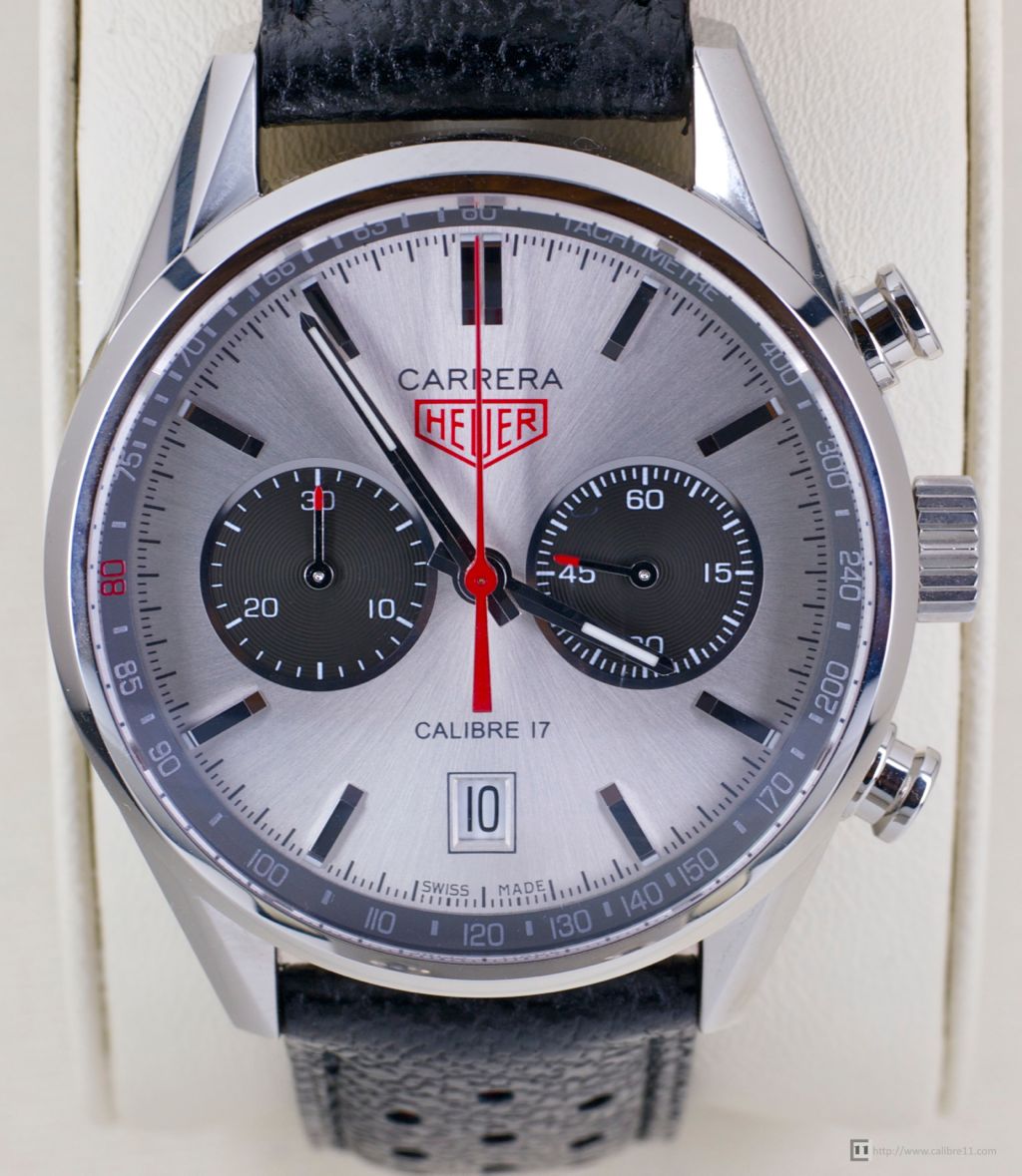 The magic of this watch is the dial, which is both what sets the watch apart from the modern Carrera range and provides the visual link to the original Heuer Carrera of the 1960s.
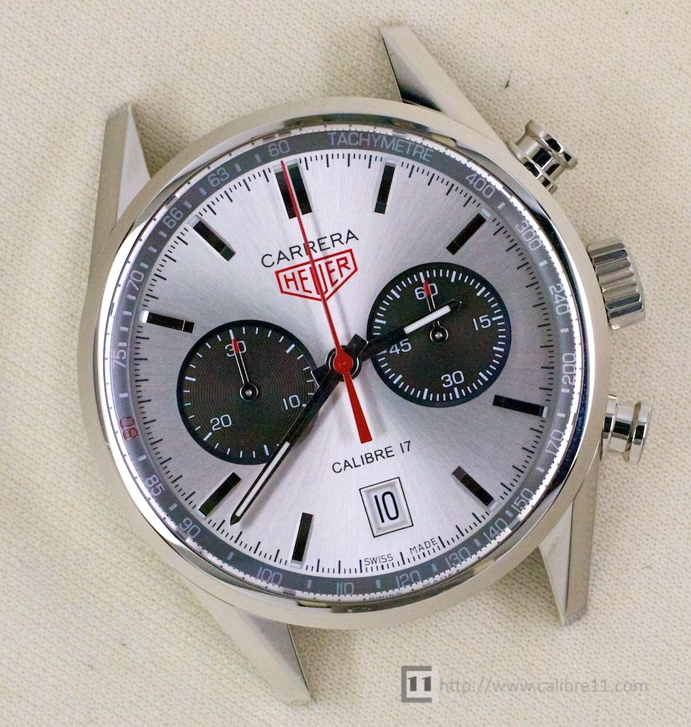
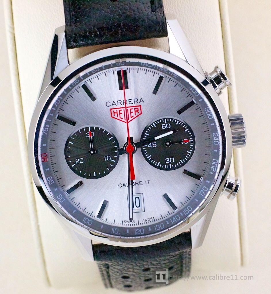
The silver dial has a star-burst finish that gives the dial a different appearance depending on the light. You can see in these photos that the dial can appear grey at times and “almost-white” at others. It’s a beautiful dial and one that you can’t stop looking at.
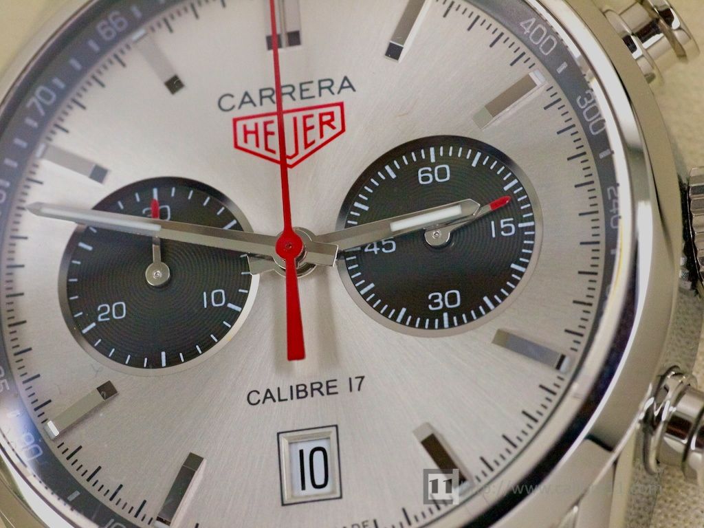
The dial has two large, recessed sub-dials, which record running seconds (right) and a 30-minute Chronograph counter (left). Both are finished with a radial pattern and bordered by a thin, angled silver frame.
The sub-dial design is attractive, although they can appear fractionally too close together. The placement of the sub-dial hands is fixed by the size of the movement, so perhaps making the registers slightly smaller would have provided a great visual separation. On a side note, it’s great to see a “bi-compax” (sub-dials at 3 and 9 o’clock) layout used again- it’s been a long time coming!
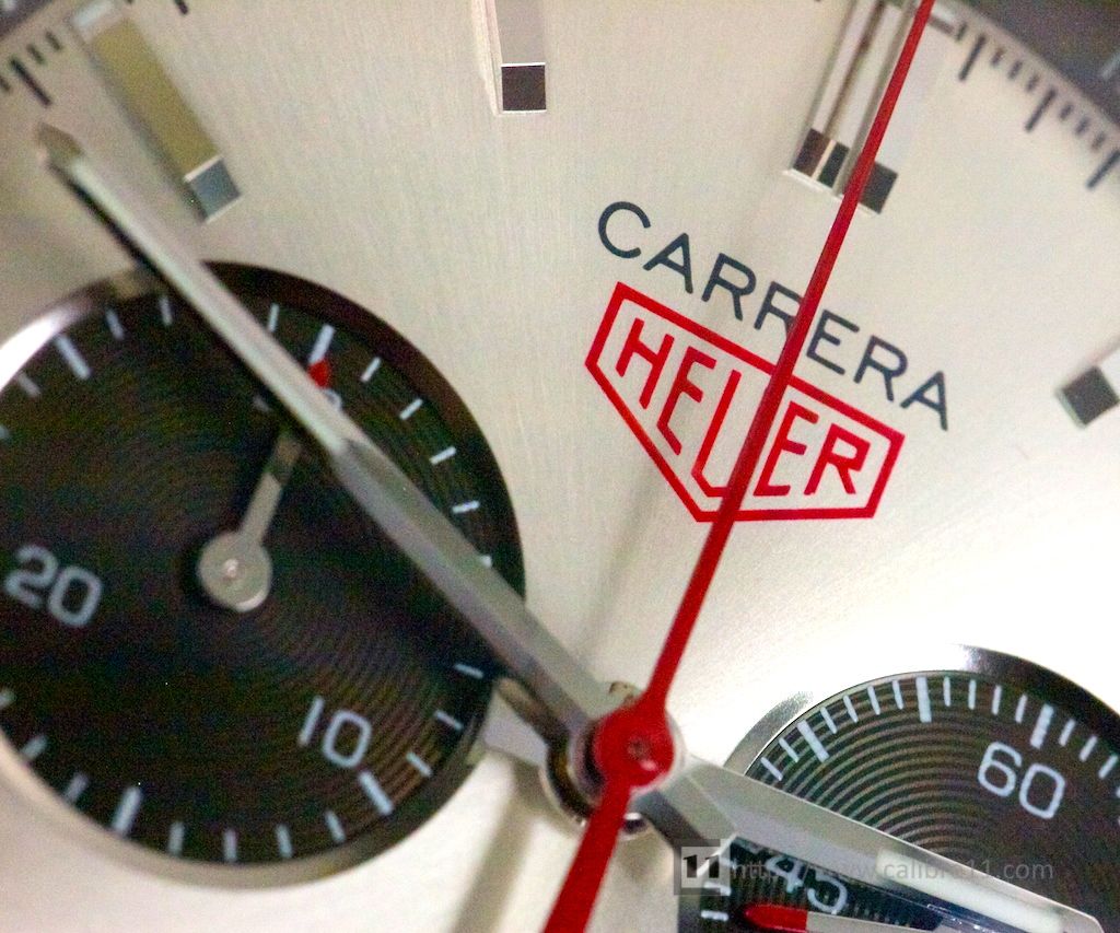 The minute and hour hands are borrowed from other watches in the Carrera range and are consistent with the style of the original ’64 Carrera. I like the thin, contoured central Chrono. hand, which in bright red provides a sharp contrast to the Silver dial.
Lume is not a strong suit of the dial, with metal hour-markers (also faithful to the ’64 Carrera) having no lume- you’ll have to rely on the hands alone to read the time at night.
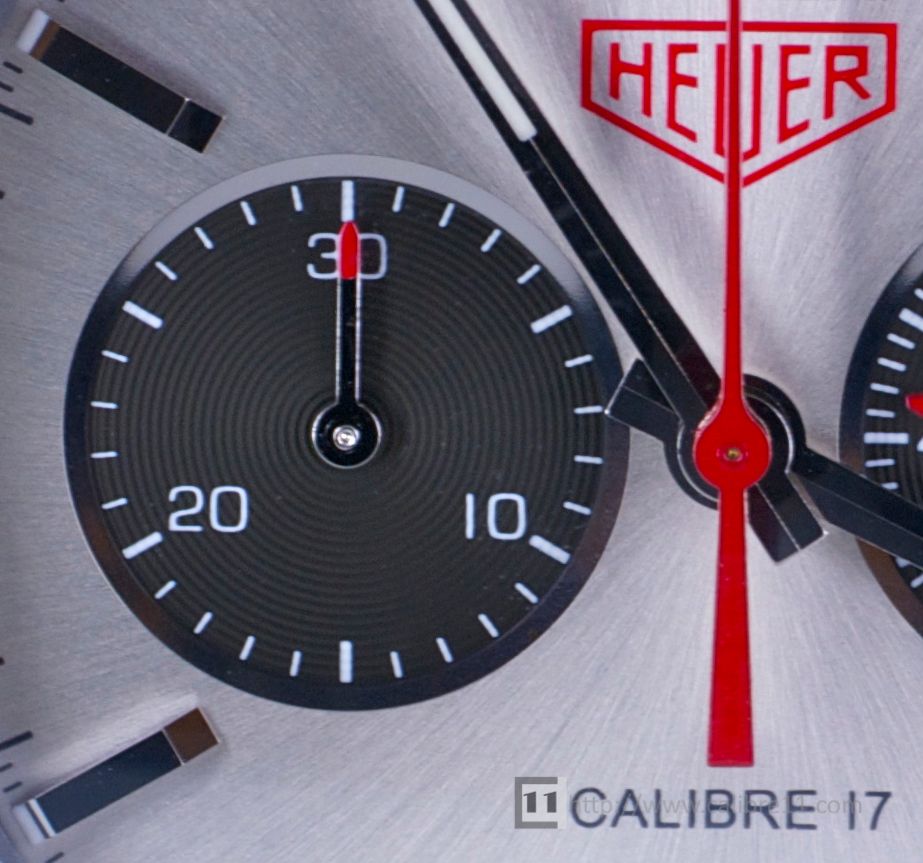
The sub-dial hands are fairly conventional, although the red tips are not 100% convincing- perhaps one red highlight too many.
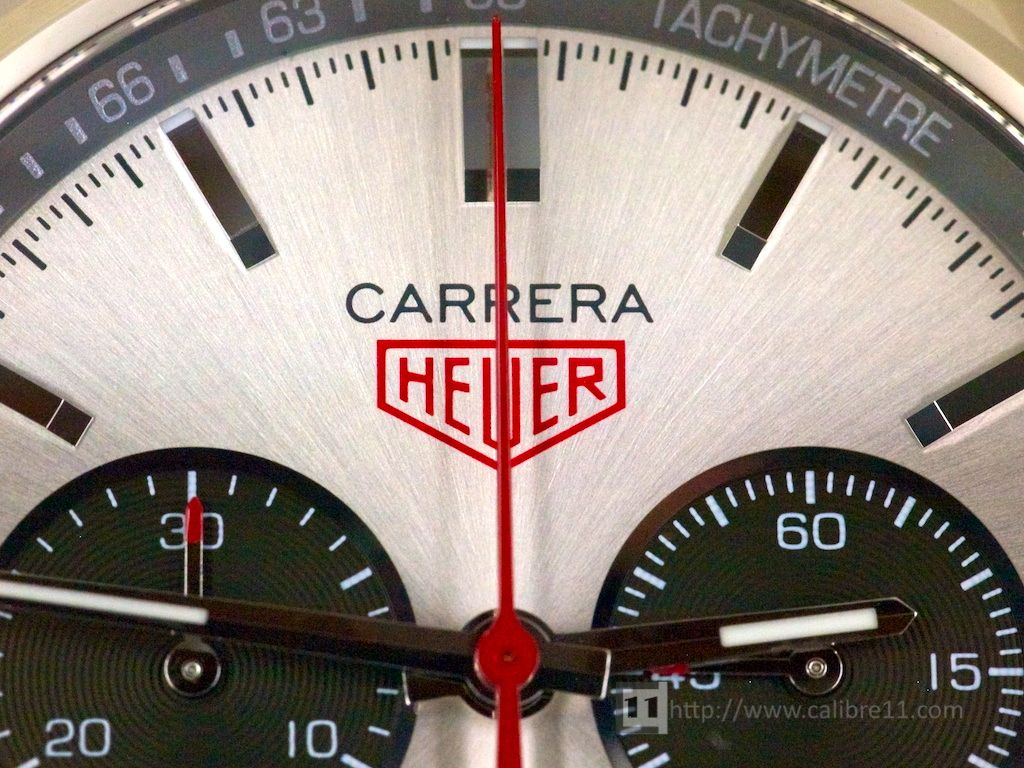 The dial has a printed “Carrera” and “Heuer” logos, with the red Heuer shield looking fantastic. It would have been a nice touch to see the word “Automatic” replace “Calibre 17“.
The final red highlight is the red “80” on the dark-grey inner- tachy bezel in a nod to Jack’s personal milestone.
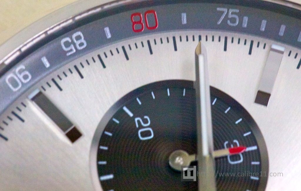 Overall the various elements of the dial are a success- a big success. The colour combination is similar to the 40th Anniversary Carrera of 2004, but with a dial more faithful to the original. There are enough elements here that pay respect to that original Carrera, yet the watch never feels like a copy or re-edition.
Case
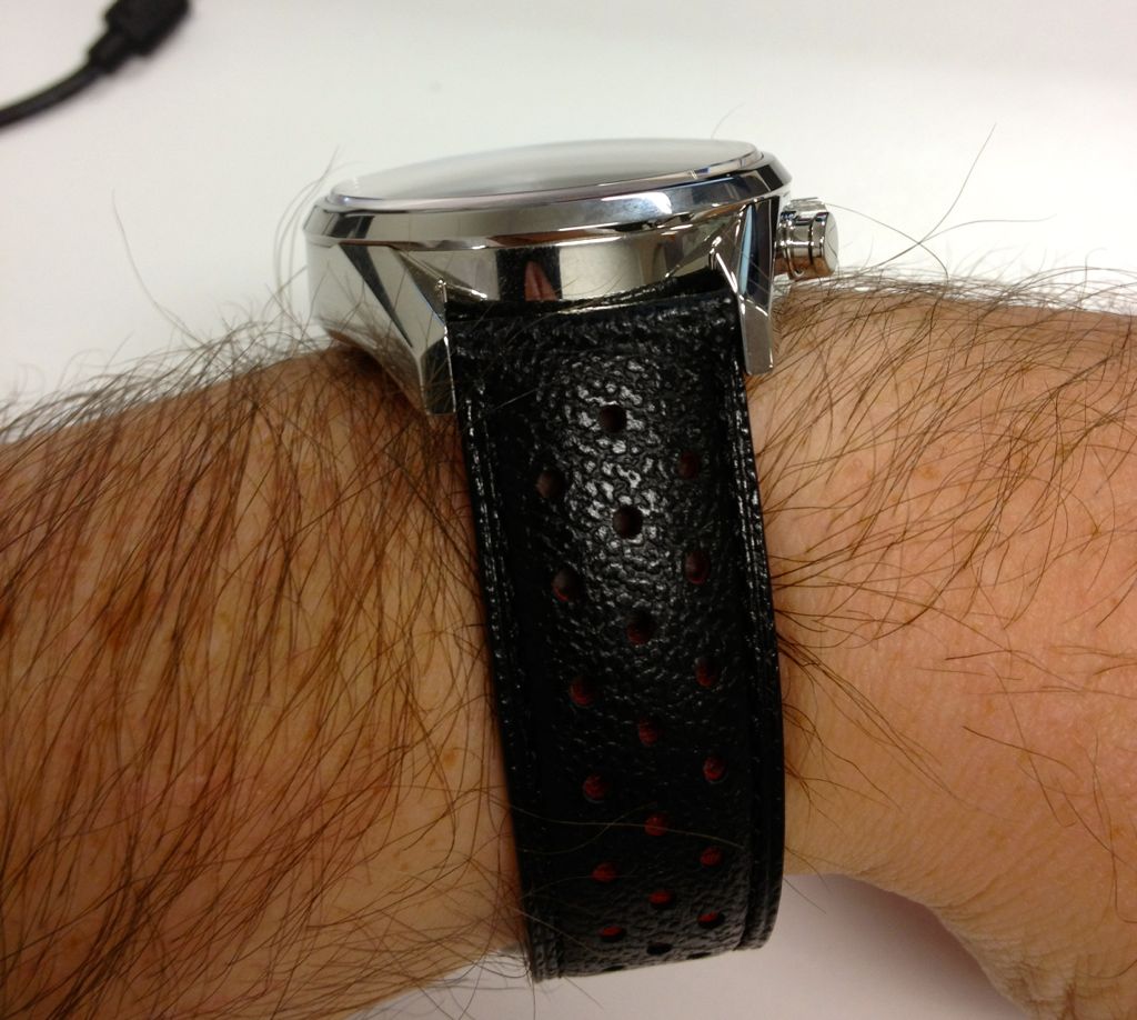
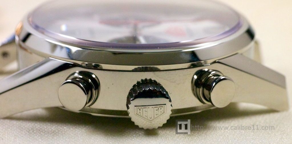 The Jack Heuer Carrera uses a 41mm stainless steel case, which retains the classic Carrera shape. Note that the pusher design is the same as used on the Carrera 1887 and while they are a different shape to the originals, they look great.
Consistent with the “Heuer” logo on the dial, the case is finished with a “Heuer” branded crown.
Did you notice in the above shot that the crown sits lower than the Chronograph pushers? This is because the Calibre 17 is a modular movement, meaning that it has a Chronograph module mounted on a watch base. An integrated Chronograph does not have this limitation, as you can see from the shots of the Carrera 1887 below.
Comparison with Carrera 1887
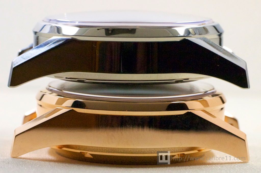
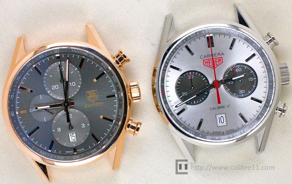 The photo above shows the new Rose Gold Carrera 1887 (41mm) alongside the Jack Heuer Carrera. In our original post, we stated that the Jack Heuer 80 case was the same as the Carrera 1887- but it isn’t.
While the two cases share the same lower-case and diameter, the top section of the case (the bezel) has a slightly different shape.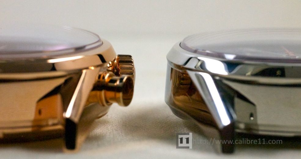 You may have read that the Carrera 80 is not as thick as the 1887- if that is true, we are talking microns of difference, as the two cases look and feel exactly the same thickness. The slope of the bezel on the Carrera 80 falls away at a sharper angle, but this is more a visual trick.
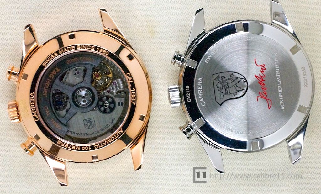
 The casebacks of the two watches are quite different, with the Gold Carrera getting the sapphire caseback to highlight the in-house Carrera 1887 movement.
 Caseback and Movement
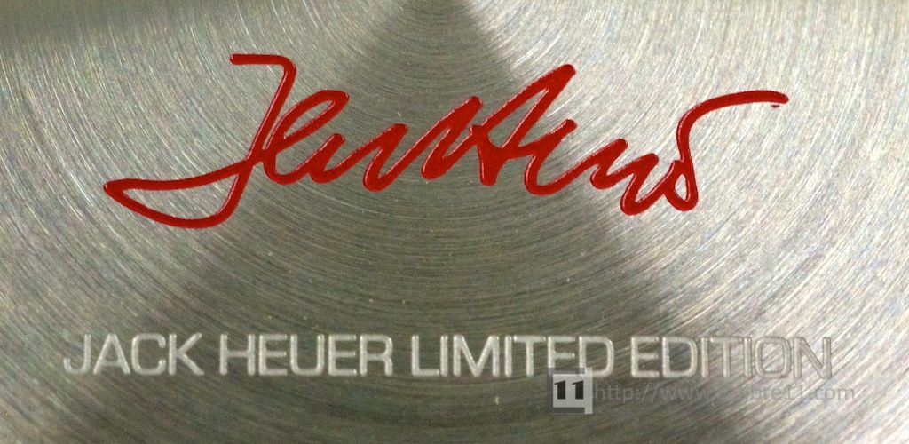
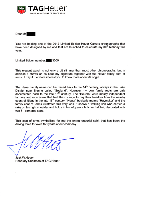
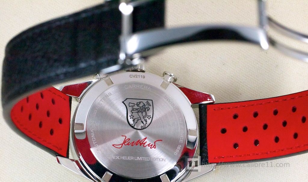 While you miss out on the Clear caseback (just as was the case with the 300 SLR of 2010), the caseback of the Jack Heuer 80 looks great, with Jack Heuer’s signature in red and the Heuer family crest in black.
 As the dial says, the watch uses a Calibre 17 movement, which is an ETA 2894-2 – the same movement that powered the Re-edition Monaco and Monza models of the early 2000s.
Strap
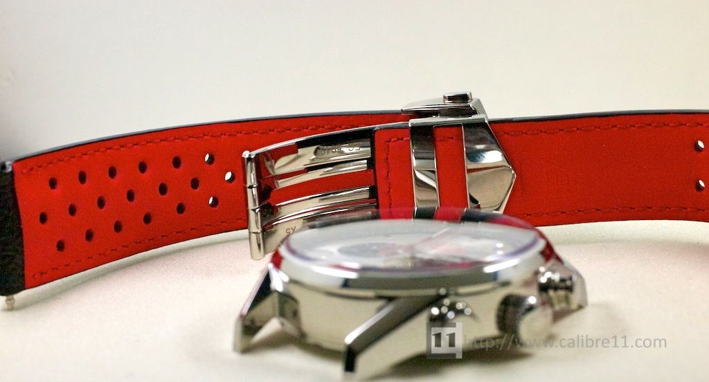 Going back a couple of years we were critical of TAG Heuer’s single-minded obsession with using Alligator leather on every strap- whether it was on a sports watch or a dress watch. This finally changed in 2009 when TAG Heuer designed a new rally style Calf-leather strap for the 40th Anniversary Monaco.
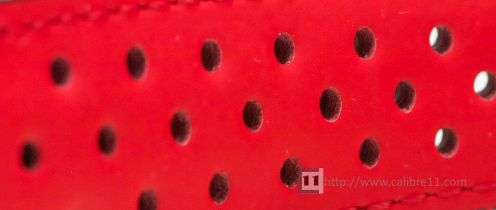
The same design has been used on several Monaco models since, and now makes its way across to the Carrera. It’s the perfect strap for this watch, and while there is also the option of a stainless steel bracelet, the strap is the best option.
The strap has a bright red-lining which you get a hint of when wearing the watch….a nice little detail that most people will never see.
The Mark Moss View
 There are very few people with a greater appreciation and knowledge of the Heuer Carrera than our regular contributor Mark Moss. So what does Mark think of the Jack Heuer 80th Birthday Carrera?
When a watch is almost pitch-perfect, it can feel like nitpicking to point out the things you don’t like about it. So I won’t do that yet, I’ll start with what I do like.
Case
I’m a big fan of the second-generation Carrera [1970s Chronomatic models] too but I can recognise that the first gen case is the iconic one. Carries with it echoes of Heuer cases past and yet a bold angularity also made it seem fresh rather than derivative. And TAG Heuer obviously still recognise that – the modern Carreras are based around this case too. And this one does it the right way, with no external bezel. And even the previous Jack Heuer limited edition, with its strong influence from second gen dials, combined it with a first gen-esque case.
Dial
Someone has been doing their background reading! Radial “starburst” brushed finish? Spot on. Or maybe a suggestion from Jack himself, as he was involved in design decisions for the watch. Sharp, chiseled markers suit it well. Not sure on the lume integration on those yet but it doesn’t jar. I thought the red Heuer shield was too much initially, but have come round on that too.
Strap
Please, anyone buying one of these, take it on the strap! I said the watch was almost pitch-perfect. Well, the strap is. Shhh shhhh, just get the strap, you’ll thank me in the end.
Now onto what I don’t like so much. Nitpicking, like I said earlier.
 The Red Highlights
I’ve got used to the shield and now like it in red. The 80 tachy highlight is subtle and inspired. So now I think it’s perhaps the markings on the needles that are a highlight too far. And look like painted fingernails.
Font
The font used on the Tachy scale. I think it’s trying to look modern and classic at the same time and, for me, it doesn’t quite manage that feat. I don’t think it would disturb day-to-day, but when I focus on it, I’m always reminded of “Space 1999” or something in that ilk.
Registers
I think the registers are a shade too sunken and make that movement too rapidly. I would make them less deep and the lip shallower and more gradual, much as on the 40th anniversary watch. But! I think the reason they haven’t is that the registers are already a bit too close together, probably a technical limitation of the movement used. Shifted out 1-2mm further, they would look better balanced, even if that necessitated some changes to the markers there.
 Crown
Crown
What’s happened to the crown between the first publicity shot and release? It’s put on weight! It’s now a mm or 2 too thick. Looks a bit like when any signed replacement crown has replaced an original Carrera one on a vintage 2447.
Summary
So in summary, the points above are just niggles, perhaps, but brought into contrast because the watch is so close to being exactly right. It is, nonetheless, still very desirable.
Wrist Shots
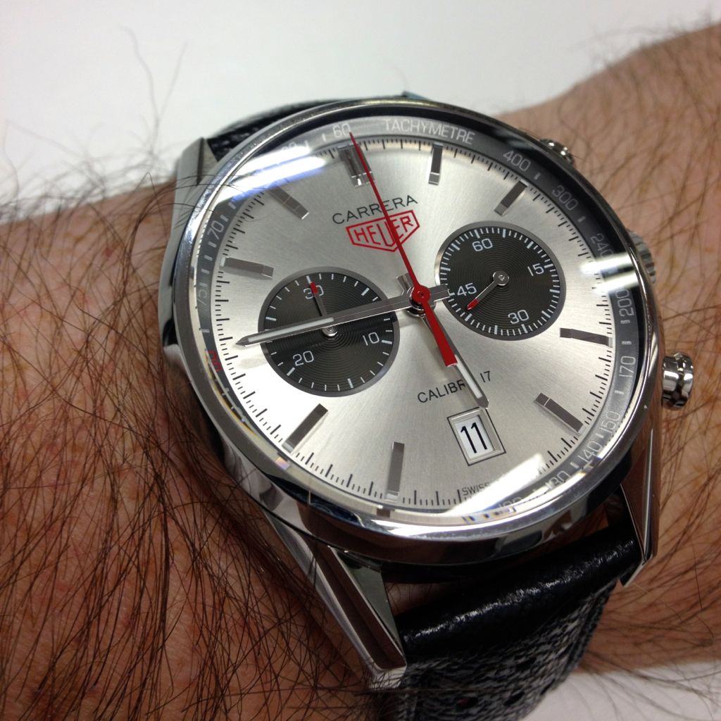 These wrist-shots were taken in natural light and probably give the best indication of the true colour of the watch’s dial- a lighter shade of silver than the photos earlier in the article.
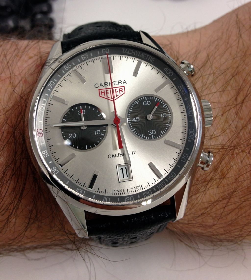 As we’ve pointed out before the current Carrera range is marked by the use of thick cases, and the Jack Heuer 80 is no exception.
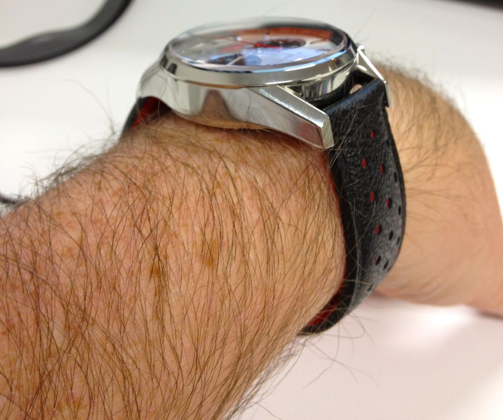 Despite this depth, the watch doesn’t feel top-heavy, perhaps because the case remains at 41mm rather than being tempted into larger sizes. The 1970s Carreras were certainly thicker than the 1960s versions, but there is no getting around the fact that the 2012 Carrera is no lightweight.
Meeting Jack Heuer
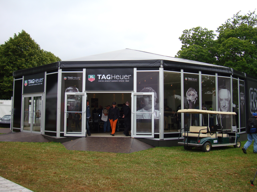
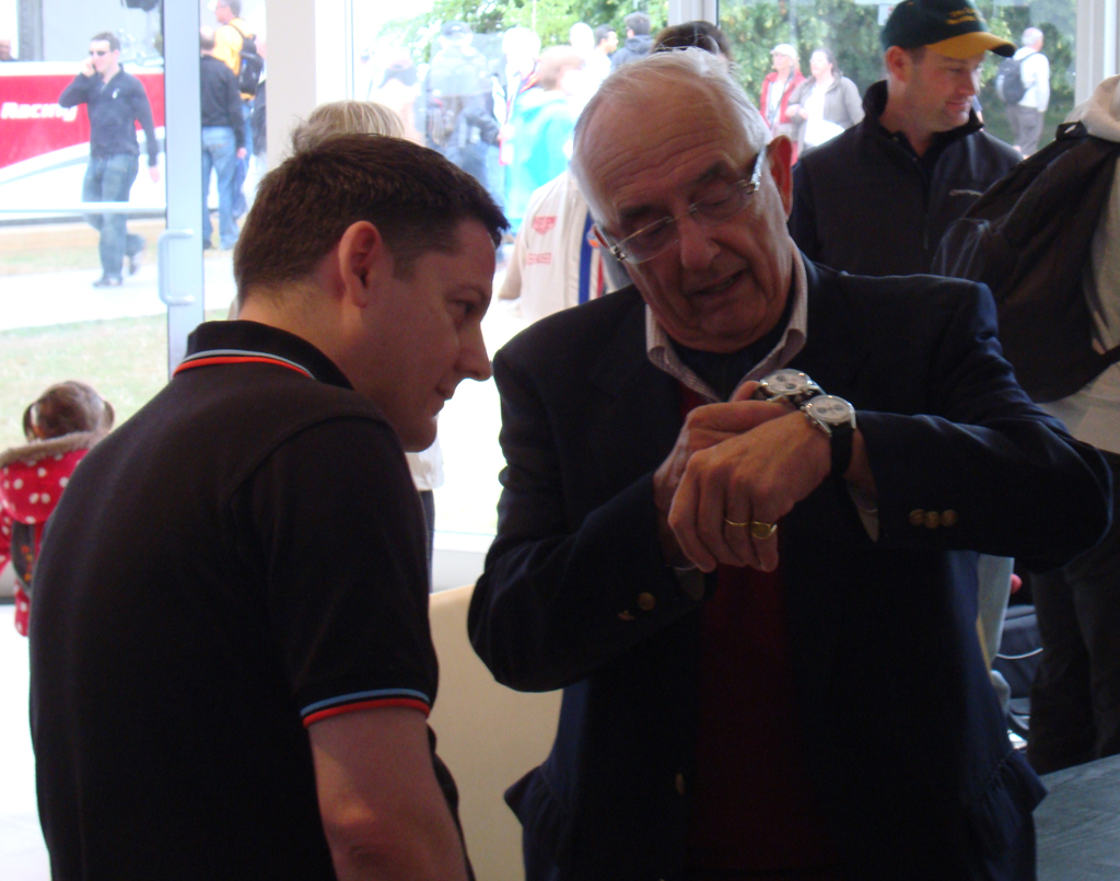
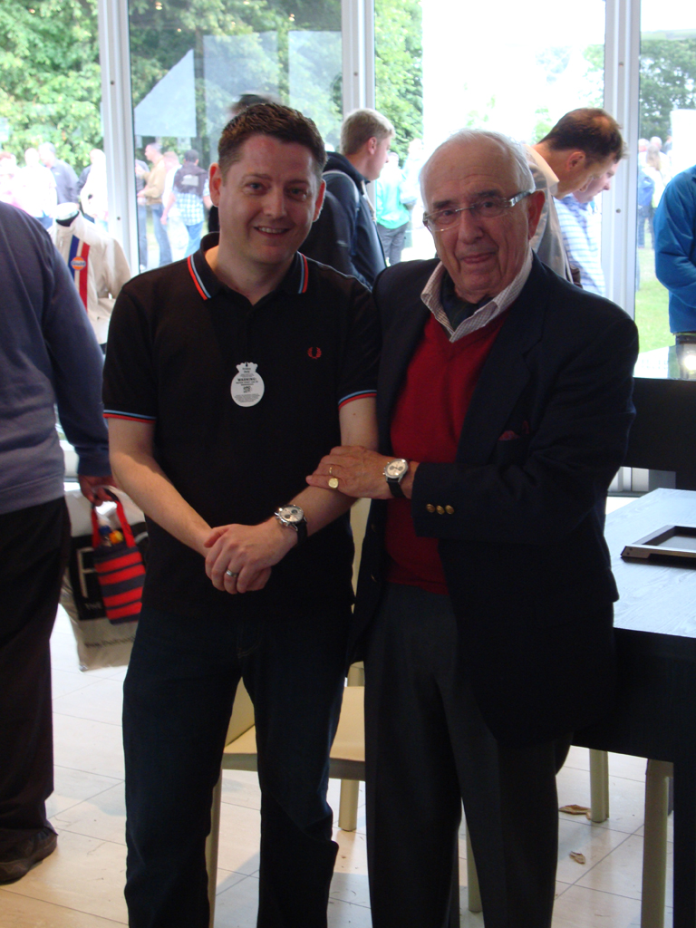
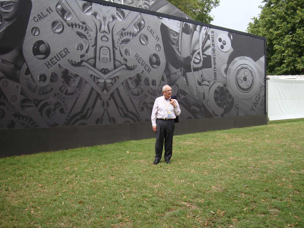 A regular reader was luck enough to spend some time meeting with Jack Heuer at the 2012 Festival of Speed at Goodwood, UK. PJS has been kind enough to share these great photos with us- many thanks for sharing.
 Price and Availability- Ref. CV2119
 The 2012 Carrera 80th Birthday is a Limited Edition of 3000 watches. TAG Heuer have resisted the temptation to increase the numbers of the watch, with the number staying as was originally announced (regular readers will recall that the Silverstone and 300 SLR Limited Edition numbers were each increased before they went on sale). 3000 won’t be enough to meet demand, which is probably exactly what TAG Heuer intended.
The watch was originally due in June/ July, although I have heard that it may slip by a couple of months. In Australia, the watch will have a recommended price of A$5250, which is likely to translate into close to CHF4500 (Swiss Francs) or the Euro equivalent in European markets.
 It’s appropriate that this watch is Jack Heuer’s swan-song watch at TAG Heuer. Since 2001, Jack Heuer has been the Honorary Chairman of TAG Heuer and he has been involved in the design of many production watches, including the Grand Carrera series and this watch. Jack has indicated that he will be less involved in official duties from this year, and certainly less travel.
The Carrera 80 is perhaps the most “complete” design that TAG Heuer have released over the last few years. It’s a beautifully resolved watch that feels- and looks- special. These may not be easy to get hold of, but it will be worth the effort for 3,000 lucky collectors.
Want to find out more about the history of the TAG Heuer Carrera? Check out the dedicated Calibre 11 Carrera mini-site to see all ten generations of the Carrera from 1963-2013.
***
